When more data became less useful
The product direction was “add more data.” Focused research revealed the real problem was helping planners understand <strong>what mattered and where to act</strong>.
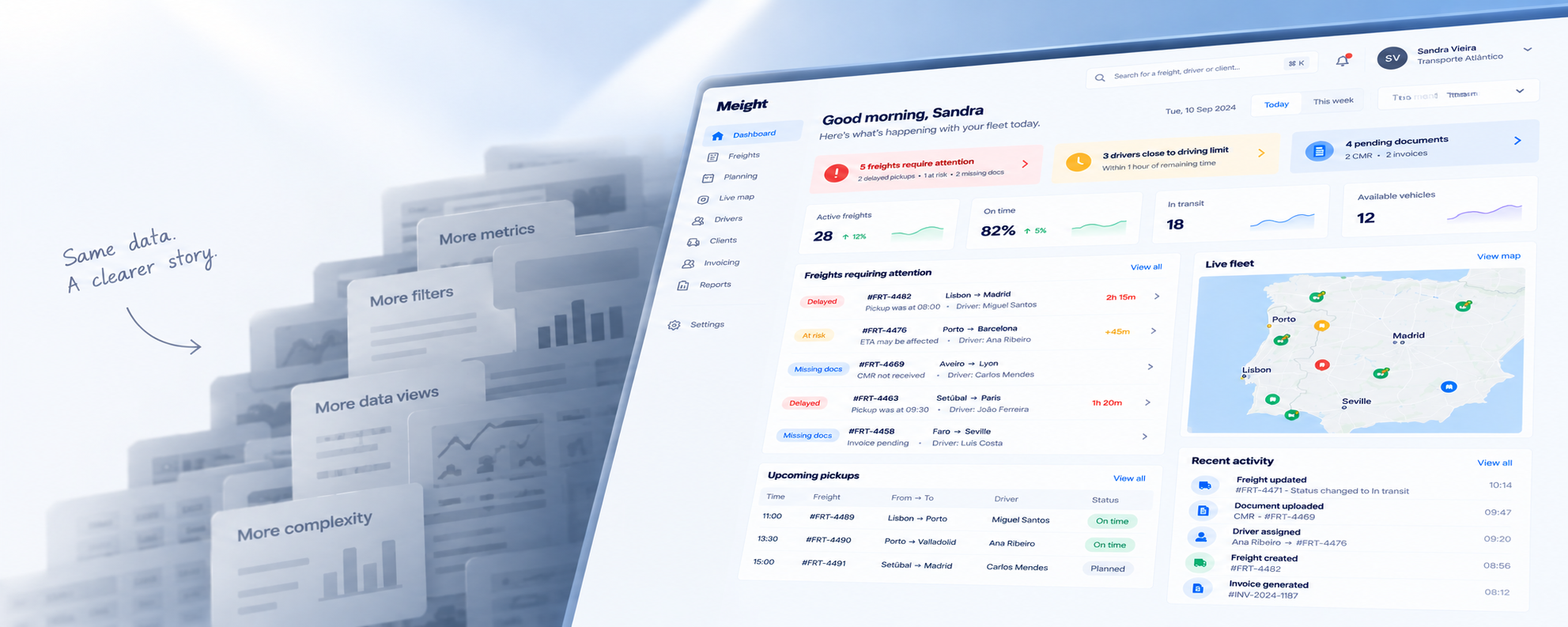
Users were asking for more data. So we were preparing to give them more.
The emerging product direction was therefore straightforward: More information = better decisions
Before increasing the amount of information on the dashboard, I wanted to understand what users were actually trying to accomplish with it, and whether more data would make those moments easier or harder.
So I went back to the users.
I didn't need months of research. I needed to test the assumption before we built around it
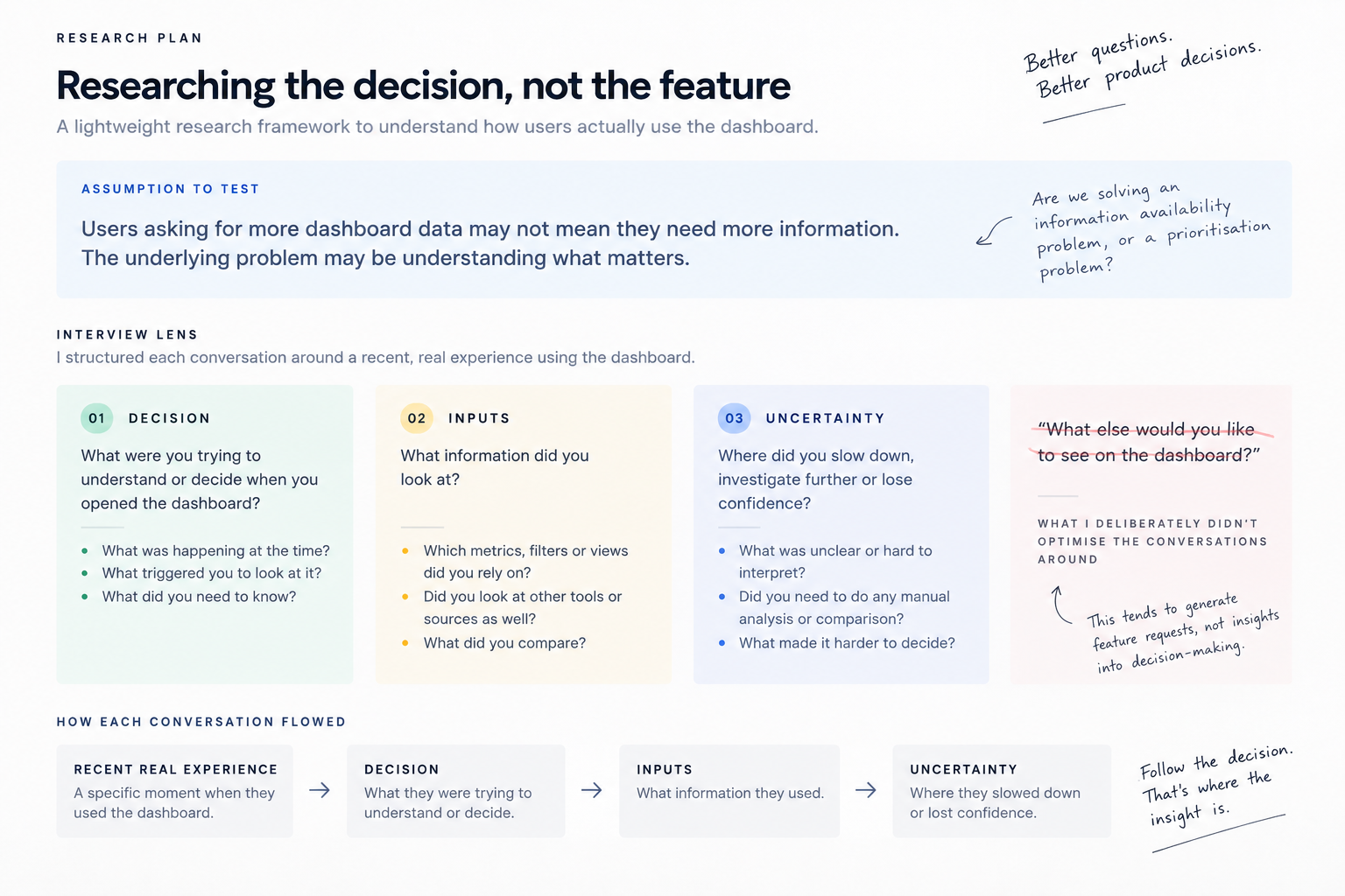
I ran a focused round of user conversations around recent, real moments when people had used the dashboard.
Instead of asking “What else would you like to see on the dashboard?” I focused the conversations around three questions:
Decision
What were you trying to understand or decide?
Inputs
What information did you look at to get there?
Uncertainty
Where did you slow down, investigate further or lose confidence?
The goal wasn't to produce a long list of feature requests.
It was to understand where the decision process broke down.
Research framework / interview guide
A lightweight research framework focused on decisions, inputs and uncertainty rather than feature requests.
I looked for breakdowns in decisions, not just clusters of complaints
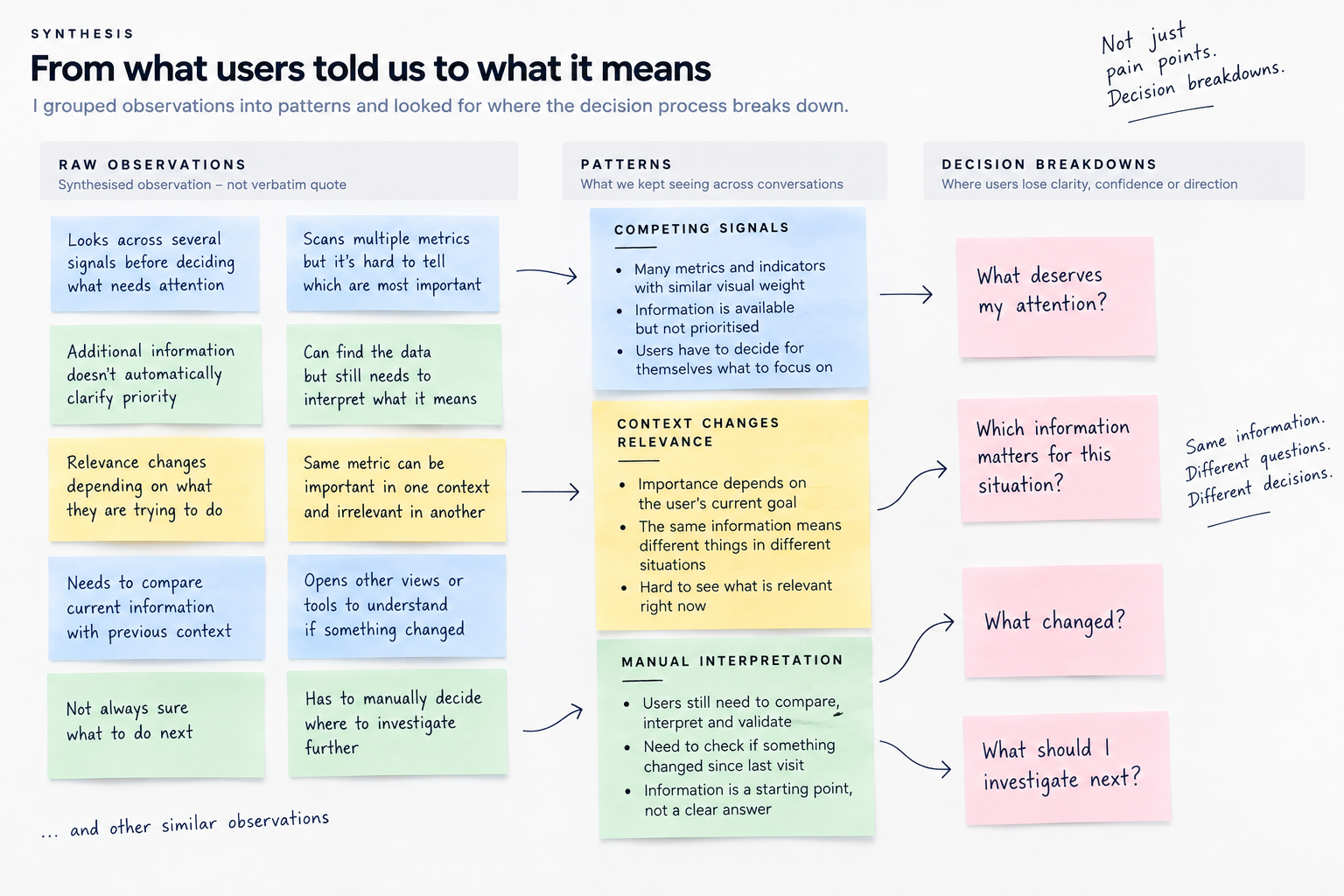
Pain points told me where users were frustrated. I wanted to understand something more useful for product decisions: where users lost clarity, confidence or direction while trying to make sense of the dashboard.
Pain point
A symptom of something that isn't working.
Decision breakdown
A point where the user loses clarity, confidence or direction while trying to decide what matters or what to do next.
Research synthesis / affinity artifact
Evidence clustered into recurring patterns and decision breakdowns, rather than a polished diagram pretending to be raw research.
Before jumping to solutions, I mapped where the product could reduce the user's work
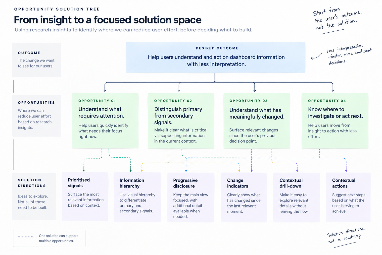
The research gave us a clearer problem, but not a single predetermined solution. I used an Opportunity Solution Tree to connect the desired outcome to the opportunities revealed by research before discussing what we should build.
The research reduced the scope instead of expanding it
The original direction was to make the dashboard more complete.
The research gave us a reason to be more selective.
Deprioritised
- More metrics
- More filters
- More data views
- More ways to explore
Prioritised
- Relevant signals
- Clear information hierarchy
- Meaningful changes
- Clearer paths to action
Three principles shaped the dashboard direction
Prioritise, don't just add
Focus attention on the signals that matter rather than giving every metric equal visibility.
Create hierarchy
Make primary information immediately understandable while keeping secondary information available when needed.
Surface meaningful change
Help users understand what has changed since their previous decision point instead of requiring manual comparison.
The screen became the consequence of the thinking, not the starting point
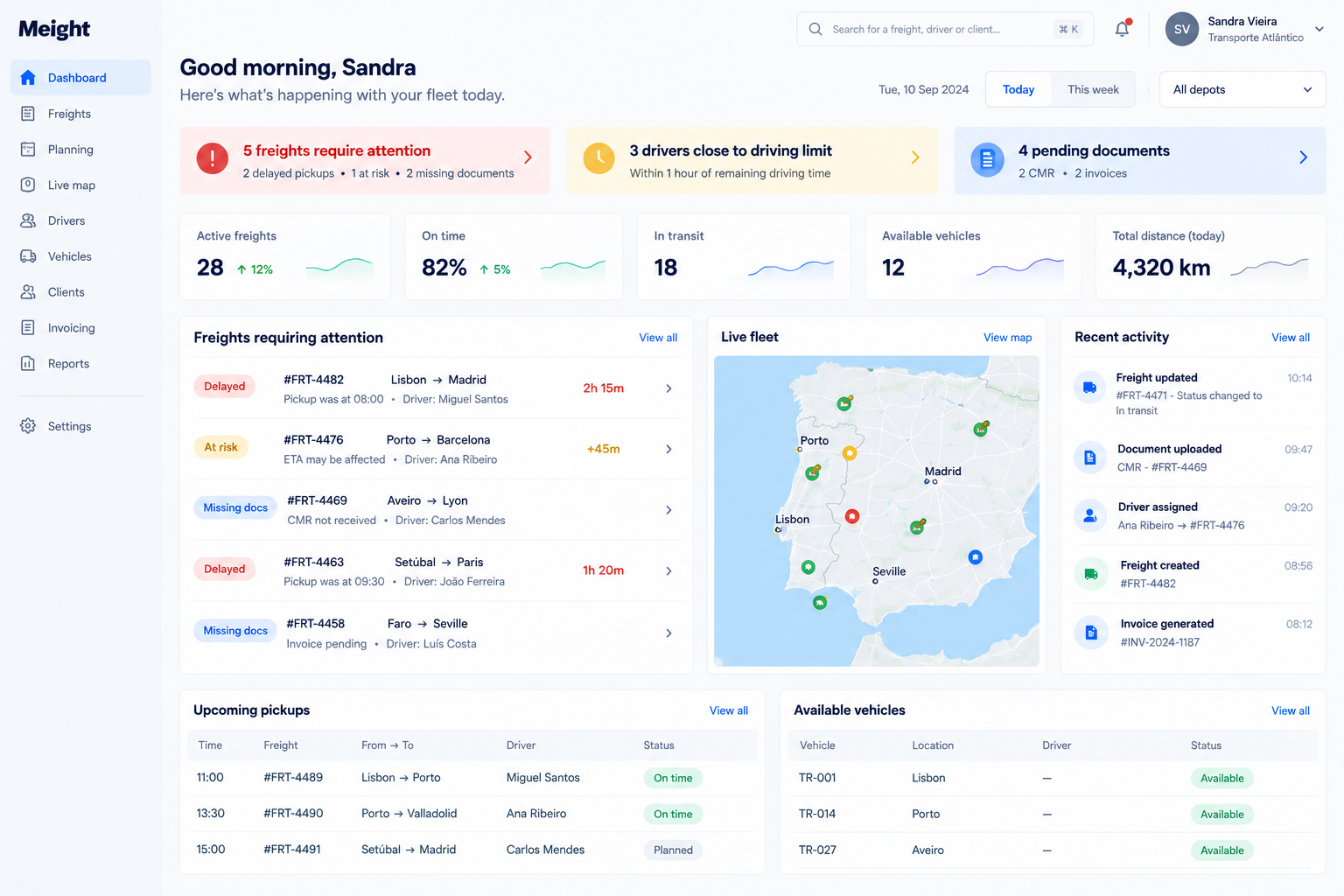
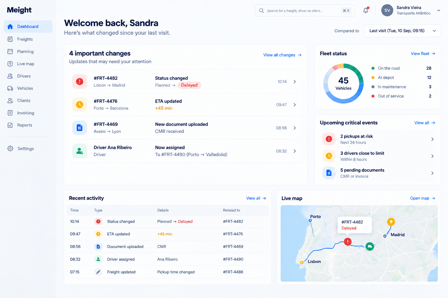
A small set of targeted interface crops, each demonstrating one specific research-derived decision rather than a full gallery of screens.
Users could access many signals, but visibility alone did not establish what deserved attention.
The dashboard establishes a clearer hierarchy between information requiring attention, supporting context and secondary detail.
Reducing competition between signals helps users understand where to focus before exploring further.
Understanding the current state could require users to interpret information without clear context about what had meaningfully changed.
The dashboard surfaces a small number of meaningful changes and exceptions rather than requiring users to reconstruct the previous state themselves.
Making change explicit reduces manual comparison and helps direct attention toward what may require investigation.
The dashboard didn't lack information. It lacked prioritisation
Across the conversations, the same pattern kept appearing: users could access information, but understanding what deserved attention still required work.
Information competed for attention
The dashboard exposed many signals, but visibility alone didn't tell users which ones mattered in the moment.
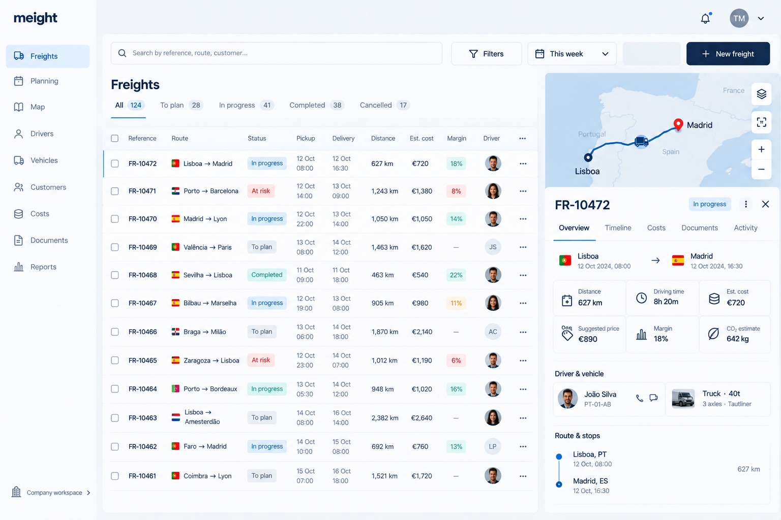
Users looked across several signals before determining what deserved attention. Having information visible did not automatically establish priority.
Synthesised from research conversations, not a verbatim quote.
Importance depended on context
A metric wasn't inherently important. Its relevance changed depending on what the user was trying to understand or decide.
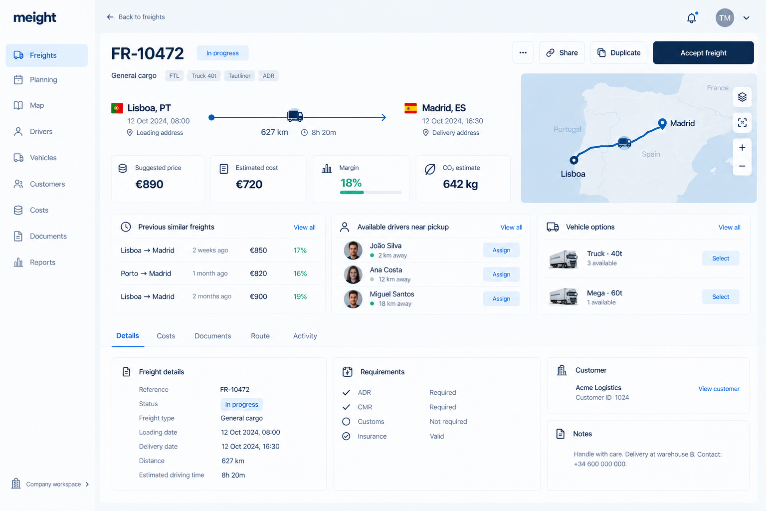
The same information could be important in one situation and secondary in another. Relevance depended on the decision the user was making.
Synthesised from research conversations, not a verbatim quote.
Interpretation still happened in the user's head
The product presented information, but users still had to compare signals and determine what they meant before knowing where to go next.
Finding the relevant information was not always the end of the task. Users still had to interpret the signals before understanding what required attention or investigation.
Synthesised from research conversations, not a verbatim quote.
We weren't solving an information availability problem.
We were solving a prioritisation problem.
Before research
How might we give users more information?
Research showed
Users already had information. The work was understanding what mattered.
After research
How might we help users understand what matters right now?
A few weeks of research changed what we chose to build
Instead of expanding the experience with more metrics, filters and views, the team reduced scope and focused on helping users interpret what was already there.
More information
- More metrics
- More filters
- More data views
- More ways to explore
Better decision support
- Prioritised signals
- Clearer hierarchy
- Meaningful changes
- Clearer paths to action
The outcome wasn't more functionality. It was greater confidence about what functionality deserved to exist.
Design for the decision. The screen is just where it happens
The biggest shift for me wasn't a dashboard pattern.
It was learning to question whether an apparent usability problem was actually a decision problem.
In complex B2B products, removing complexity isn't always possible. The more useful question is whether the product helps people navigate that complexity with clarity and confidence.
I now start by asking:
- What decision is this person trying to make?
- What do they need to know to make it well?
- Where does uncertainty enter the process?
- What can the product do to reduce that uncertainty without adding more complexity?
Research didn't give us a longer list of features to build.
It gave us a better reason for deciding what not to build.